How to Create a Top Page in Next.js 14 and Implement Navigation to Login and Account Registration Screens
This post is also available in .
Introduction
In this article, we will use Next.js and Tailwind CSS to create a top page with simple authentication-related functionality.
We will configure it so that clicking buttons allows navigation to the login screen and the account registration screen.
We will use Next.js 14 to create the top page and use Tailwind CSS and ShadCN UI for styling. You will learn the basics of creating pages in Next.js and implementing page navigation.
Goal of This Tutorial
The goal of this article is to get Next.js into a runnable state and place a title and buttons on the top page.
After that, when the buttons are clicked, the app will navigate to the login screen and the account registration screen.
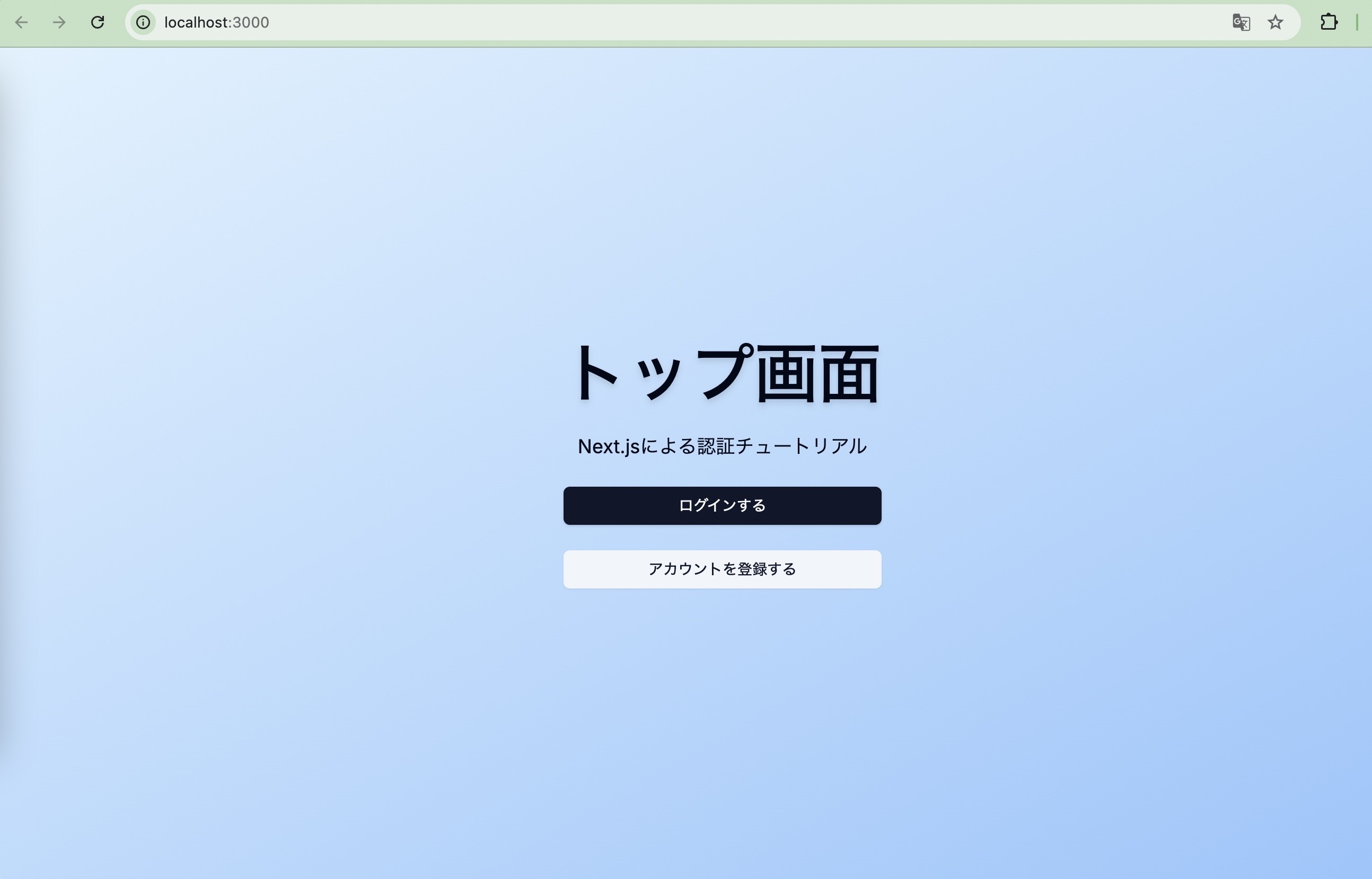
- Image of the completed top page
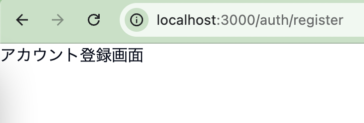
- Clicking the buttons navigates to the login screen and the account registration screen
If you have already created pages in Next.js or implemented page navigation before, you can skip this article without any problem.
What Is Tailwind CSS?
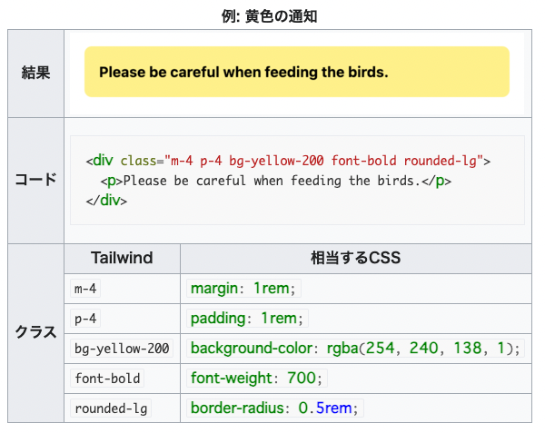
Unlike other CSS frameworks such as Bootstrap, the distinguishing feature of this library is that it does not provide a set of predefined classes for elements such as buttons and tables. Instead, it provides "utility" CSS classes that can be combined to style elements.
Source: https://ja.wikipedia.org/wiki/Tailwind_CSS
If you have written CSS before, you can probably imagine this: instead of writing CSS directly, you can define something CSS-like in a slightly more concise way.
Vercel, the company that develops Next.js, recommends Tailwind CSS, and during the Next.js setup that appears later, you can choose to install Tailwind CSS together.
We will also use it in this tutorial.
What Is shadcn/ui?
shadcn/ui is a library that provides reusable components built using Radix UI, a React UI component library, and Tailwind CSS, a CSS framework.
We will later create input forms, buttons, and other components needed for implementation, but building everything from scratch using only div tags and button tags would be time-consuming.
We will leverage this library to shorten implementation time.
Environment Setup
Run the following command to set up Next.js version 14.
$ npx create-next-app@14.0.4 tutorial-nextjs-14-auth
You will be asked several questions; you can safely answer Yes to all of them.
The third question is about Tailwind CSS, which we just introduced.
By selecting Yes, Tailwind CSS will be ready to use immediately.
Need to install the following packages:
create-next-app@14.0.4
Ok to proceed? (y) y
✔ Would you like to use TypeScript? … No / Yes
✔ Would you like to use ESLint? … No / Yes
✔ Would you like to use Tailwind CSS? … No / Yes
✔ Would you like to use `src/` directory? … No / Yes
✔ Would you like to use App Router? (recommended) … No / Yes
✔ Would you like to customize the default import alias (@/*)? … No / Yes
Creating a new Next.js app in /Users/test/Documents/workspace/tutorial-nextjs-14-auth.

Using npm.

Initializing project with template: app-tw

Installing dependencies:
- react
- react-dom
- next

Installing devDependencies:
- typescript
- @types/node
- @types/react
- @types/react-dom
- autoprefixer
- postcss
- tailwindcss
- eslint
- eslint-config-next
Now let’s start Next.js once.
$ npm run dev
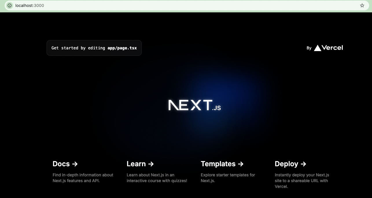
If you see the following screen at localhost:3000, you are good to go.
Next, install shadcn.
npx shadcn@latest init
You will again be asked several questions.
- Style? ->
New York - Base Color? ->
slate - Use CSS Variables? ->
true
You can change these settings later.
✔ Preflight checks.
✔ Verifying framework. Found Next.js.
✔ Validating Tailwind CSS.
✔ Validating import alias.
✔ Which style would you like to use? › New York
✔ Which color would you like to use as the base color? › Slate
✔ Would you like to use CSS variables for theming? … no / yes
✔ Writing components.json.
✔ Checking registry.
✔ Updating tailwind.config.ts
✔ Updating app/globals.css
✔ Installing dependencies.
✔ Created 1 file:
  - lib/utils.ts

Success! Project initialization completed.
You may now add components.
Once installation is complete, you should see that several files have been added.
The settings you just chose are reflected here.
{
  "$schema": "https://ui.shadcn.com/schema.json",
  "style": "new-york",
  "rsc": true,
  "tsx": true,
  "tailwind": {
    "config": "tailwind.config.ts",
    "css": "app/globals.css",
    "baseColor": "slate",
    "cssVariables": true,
    "prefix": ""
  },
  "aliases": {
    "components": "@/components",
    "utils": "@/lib/utils",
    "ui": "@/components/ui",
    "lib": "@/lib",
    "hooks": "@/hooks"
  }
}
A file like the following is also created under /lib.
import { clsx, type ClassValue } from "clsx"
import { twMerge } from "tailwind-merge"

export function cn(...inputs: ClassValue[]) {
  return twMerge(clsx(inputs))
}
This is a convenient function for writing Tailwind CSS.
We will explain how to use it later.
Up to this point, we have only set up the foundation for using shadcn;
to use each individual component, you will install them one by one as needed.
First, let’s install the button component.
$ npx shadcn@latest add button
This will create the following file under /components/ui.
import * as React from "react"
import { Slot } from "@radix-ui/react-slot"
import { cva, type VariantProps } from "class-variance-authority"

import { cn } from "@/lib/utils"

const buttonVariants = cva(
  "inline-flex items-center justify-center whitespace-nowrap rounded-md text-sm font-medium transition-colors focus-visible:outline-none focus-visible:ring-1 focus-visible:ring-ring disabled:pointer-events-none disabled:opacity-50",
  {
    variants: {
      variant: {
        default:
          "bg-primary text-primary-foreground shadow hover:bg-primary/90",
        destructive:
          "bg-destructive text-destructive-foreground shadow-sm hover:bg-destructive/90",
        outline:
          "border border-input bg-background shadow-sm hover:bg-accent hover:text-accent-foreground",
        secondary:
          "bg-secondary text-secondary-foreground shadow-sm hover:bg-secondary/80",
        ghost: "hover:bg-accent hover:text-accent-foreground",
        link: "text-primary underline-offset-4 hover:underline",
      },
      size: {
        default: "h-9 px-4 py-2",
        sm: "h-8 rounded-md px-3 text-xs",
        lg: "h-10 rounded-md px-8",
        icon: "h-9 w-9",
      },
    },
    defaultVariants: {
      variant: "default",
      size: "default",
    },
  }
)

export interface ButtonProps
  extends React.ButtonHTMLAttributes<HTMLButtonElement>,
    VariantProps<typeof buttonVariants> {
  asChild?: boolean
}

const Button = React.forwardRef<HTMLButtonElement, ButtonProps>(
  ({ className, variant, size, asChild = false, ...props }, ref) => {
    const Comp = asChild ? Slot : "button"
    return (
      <Comp
        className={cn(buttonVariants({ variant, size, className }))}
        ref={ref}
        {...props}
      />
    )
  }
)
Button.displayName = "Button"

export { Button, buttonVariants }
We will use the Button (and buttonVariants if needed), which is exported at the end, to implement buttons.
If you read the code, you will see keys called variant and size.
Each of these has various Tailwind CSS classes defined.
When using the button component, you can customize the color and size of the button to your liking by using these variant and size props.
Creating the Top Page
First, to check that the button component works, write the following code in page.tsx under /app.
import { Button } from "@/components/ui/button"

export default function Home() {
  return (
    <main>
      <Button variant='destructive' size='lg'>Test Button</Button>
    </main>
  )
}
When you start Next.js, you should see a red button.
This time we set variant='destructive', so the button is red, but if you use other variant values, you should see the color change.
Now that we have confirmed that the button component works, let’s create the top page.
Add the following code to globals.css. The shadcn installation has already written a lot of code there, but leave that as is.
@tailwind base;
@tailwind components;
@tailwind utilities;

+ html,
+ body,
+ :root {
+   height: 100%;
+ }

Following lines omitted
Next, we will create components that implement navigation logic in the button components.
- Component that navigates to the account registration screen
- Component that navigates to the login screen
We will create two components.
Under /components/auth:
'use client'

import { useRouter } from 'next/navigation'
import { Button } from '../ui/button'

export const LoginButton = () => {
  const router = useRouter()
  const onClick = () => {
    router.push('/auth/login')
  }
  return (
    <Button onClick={onClick} className="w-full cursor-pointer">
      Login
    </Button>
  )
}
Also under /components/auth:
'use client'

import { useRouter } from 'next/navigation'
import { Button } from '../ui/button'

export const RegisterButton = () => {
  const router = useRouter()
  const onClick = () => {
    router.push('/auth/register')
  }
  return (
    <Button
      onClick={onClick}
      variant="secondary"
      className="w-full cursor-pointer"
    >
      Register Account
    </Button>
  )
}
After creating them, use these components on the top page.
import { LoginButton } from '@/components/auth/login-button'
import { RegisterButton } from '@/components/auth/register-button'

export default function Home() {
  return (
    <main className="flex h-full flex-col items-center justify-center bg-sky-100">
      <div className="space-y-6 text-center">
        <h1 className={'text-6xl font-semibold drop-shadow-md'}>
          Top
        </h1>
        <p className="text-lg">Tutorial by Next.js & Auth0</p>
        <div>
          <LoginButton />
        </div>
        <div>
          <RegisterButton />
        </div>
      </div>
    </main>
  )
}
If, after starting Next.js, you see something like the following, you are all set.
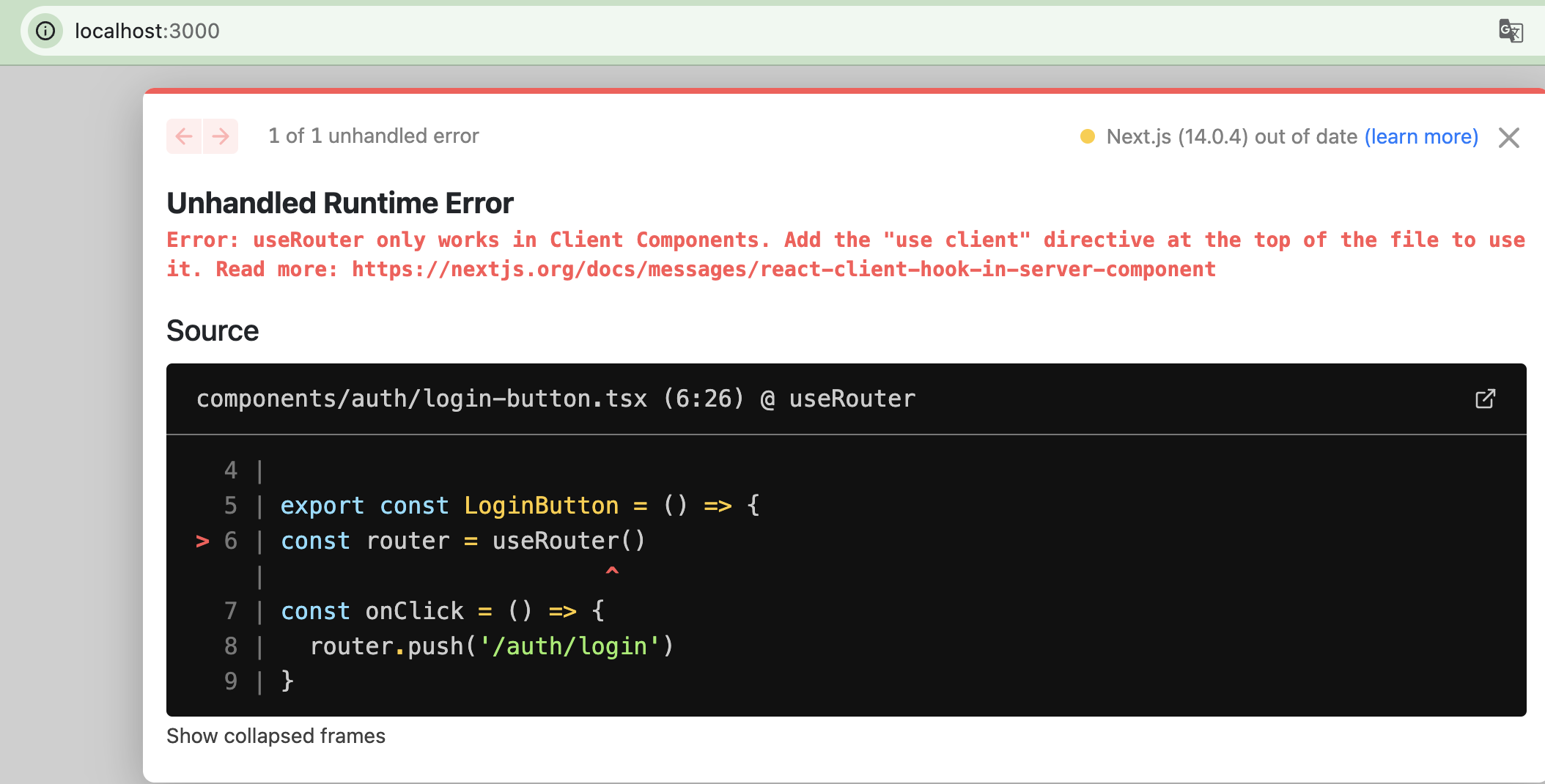
Note: You may see a screen like this in some cases.
This message often appears when you forget to add 'use client' in a case where a client component is required.
In this example, check that you have not forgotten it in files such as login-button.tsx or register-button.tsx.
At the moment, when you click the buttons, you will probably see “404 | This page could not be found.”
In the final section of this article, we will create the login and account registration screens.
Creating the Login and Account Registration Screens
- Login screen
Create the following file under /app/auth/login.
const LoginPage = () => {
  return <div>Login Page</div>
}

export default LoginPage
- Account registration screen
Create the following file under /app/auth/register.
const RegisterPage = () => {
  return <div>Sign Up Page</div>
}

export default RegisterPage
If you can navigate from the top page to each of these pages, you are done.
Summary
In this article, we set up Next.js and shadcn.
Then, using the installed libraries, we created the top page and confirmed that clicking the buttons correctly triggered page navigation.
Next time, we will again make use of these libraries to build the input form used on the account registration screen.
As we build it, we will also dig a bit deeper into how to use Tailwind CSS and shadcn.
Next Article
Questions about this article 📝
If you have any questions or feedback about the content, please feel free to contact us.Go to inquiry form
Related Articles
Chat App (with Image/PDF Sending and Video Call Features)
2024/07/15Practical Component Design Guide with React × Tailwind CSS × Emotion: The Optimal Approach to Design Systems, State Management, and Reusability
2024/11/22Building and Operating a Design System Using Chakra UI, ShadCN, and Material UI
2024/03/12Management Dashboard Features (Graph Display, Data Import)
2024/06/02Tutorial for Implementing Authentication with Next.js and Auth.js
2024/09/13Thorough Comparison of the Best ORMs for the Next.js App Router: How to Choose Between Prisma / Drizzle / Kysely / TypeORM [Part 1]
2025/03/13Test Strategy in the Next.js App Router Era: Development Confidence Backed by Jest, RTL, and Playwright
2025/04/22Done in 10 minutes. Easy deployment procedure for a Next.js app using the official AWS Amplify template
2024/11/05


